How design shapes protest
Every banner, every poster, every color choice is a statement. Here's why the visual decisions your movement makes matter – and how to design for impact
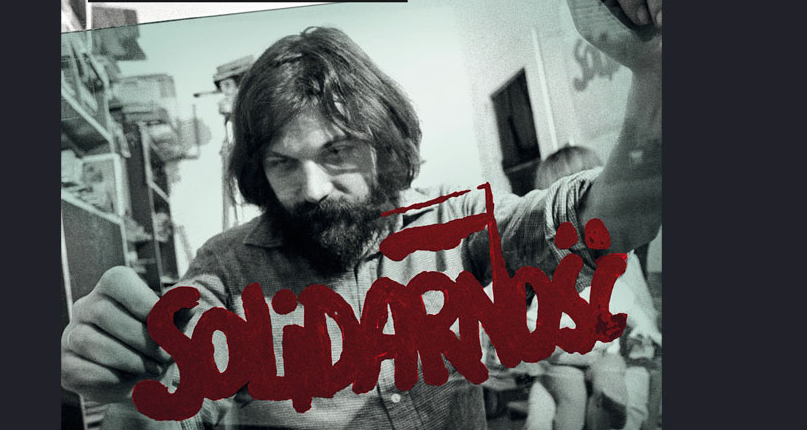
Jerzy Janiszewski drawing the sign "Solidarność", 1981
Source: jerzy-janiszewski.com
When Lech Wałęsa and his fellow workers walked out of the Lenin Shipyard in Gdańsk in 1980, defying a communist government that had banned independent organizing, they carried with them something that would outlast the strike itself: a logo. The word Solidarność – Solidarity – rendered in red, hand-drawn letters, formed the shape of people joined together in a dense crowd. Designed by Jerzy Janiszewski, it became one of the most recognized symbols of the twentieth century.
That's what design does at its best – giving a movement recognizability, a visual language that people can rally around, and a signal that says: we exist, we are organized, and we are not going away.
For civil society organizations, activists, and grassroots movements, design literacy can be a tool of power.
Visual materials shape the emotions of people inside the movement and define how a collective sees and presents itself to the world.
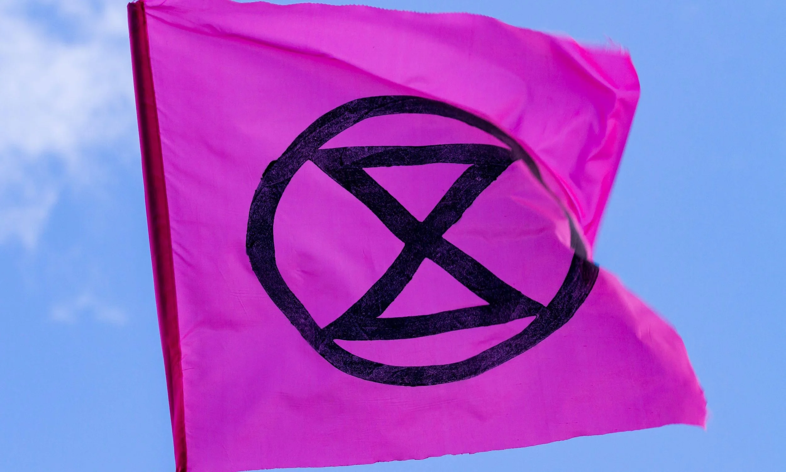
Photo: Nicola K photos/Alamy
Visual identity: The architecture of solidarity
Visual materials do more work than most activists realize – they communicate grievances, attract public attention, shape the emotions of people inside the movement, and define how a collective sees and presents itself to the world. A visual identity is the set of design choices that distinguish a movement: its colors, typefaces, symbols, and the consistent way these appear across everything it produces – from a banner to a social post to a sticker.
Two recent movements illustrate the importance of creating visual identities:
Black Lives Matter (BLM): Design Action Collective, an Oakland-based studio, was given three days to create BLM's first logo. "Being easily replicable was the main goal," designer Sonia Warren-White told Fast Company. The result – bold, high-contrast, deliberately open – became a global visual language that people could hand-paint on a placard without a printer or budget.
Extinction Rebellion (XR): XR's visual identity was built around the same principle but with more explicit brand strategy. Designer Clive Russell was clear about the brief: they needed the movement to feel inclusive and open, and different from previous environmental movements. All design assets were made freely downloadable for non-commercial use, letting anyone make their own protest materials while maintaining visual coherence. The V&A has since acquired XR design objects into its permanent collection.
The lesson across both: you don't need a big budget. You need clarity of intent and a system open enough that anyone can join in.
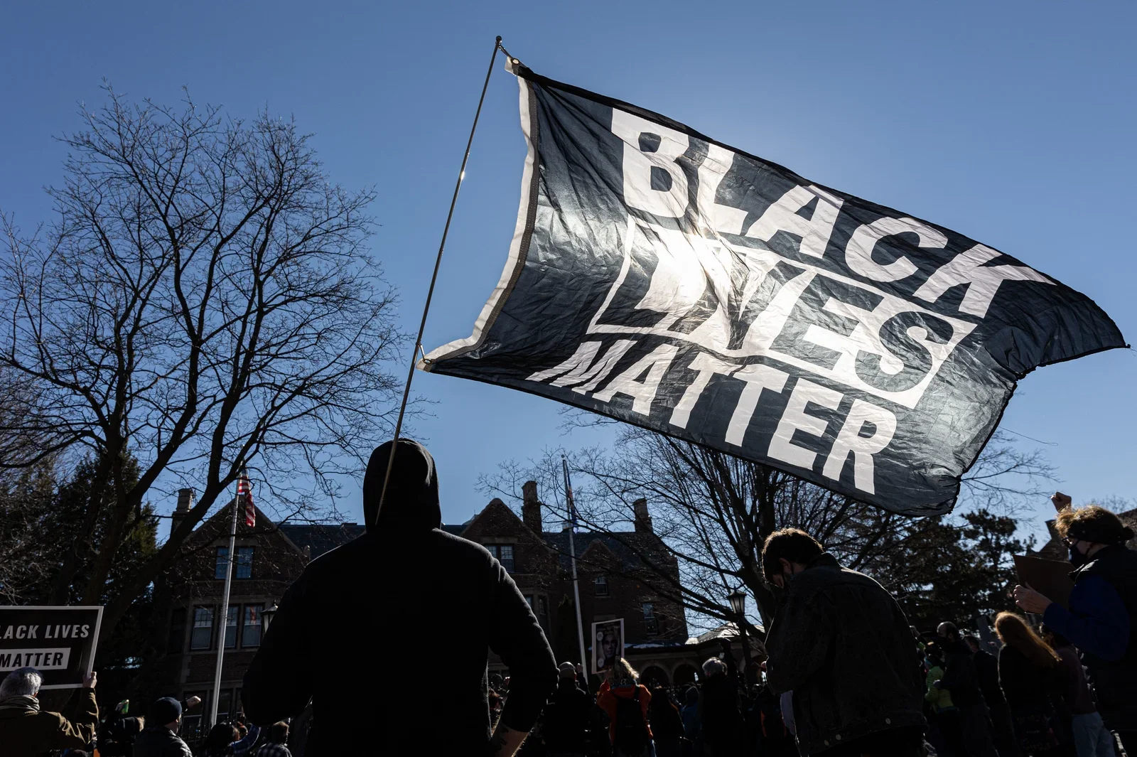
A man holds a Black Lives Matter flag during a March protest in St. Paul, Minnesota.
Photo © Kerem Yucel/AFP via Getty Images
Symbols: the compressed statement
If visual identity is the system, a symbol is its sharpest point – a single image that is a shortcut through complexity and compresses an entire political stance into something you can chalk on pavement, stitch onto a jacket, or set as a profile picture, marking your belonging to a collective without saying a word.
The raised fist has done this work for over a century – claimed by labour movements, Black Power, feminism, antifascism, climate activism. It travels because it is abstract enough to mean resistance without specifying whose.
As Alicia Garza, co-founder of Black Lives Matter, put it: “Because we’re not building businesses who depend on brands for recognition so they can make money, I think a lot of [organizers] don’t pay attention to the salience of what it means to have a symbol people can recognize you by.”
More recent symbols show how this can work in the social media age. When Poland's Constitutional Tribunal effectively banned abortion in October 2020, protests erupted across the country. Their symbol was a red lightning bolt, designed by Warsaw graphic designer Ola Jasionowska for an earlier wave of women's rights protests in 2016. Jasionowska told The Art Newspaper she wanted something "easily recognizable, something that could be shared widely and immediately understood." It spread globally – adapted in Paraguay, the US, across Europe.
Emory Douglas understood the deeper stakes of this. As Minister of Culture for the Black Panther Party and chief art director of their newspaper from 1967, Douglas didn't just illustrate a movement – he constructed its self-image, depicting Black people as proud revolutionaries rather than victims, at a time when mainstream media offered almost nothing else.
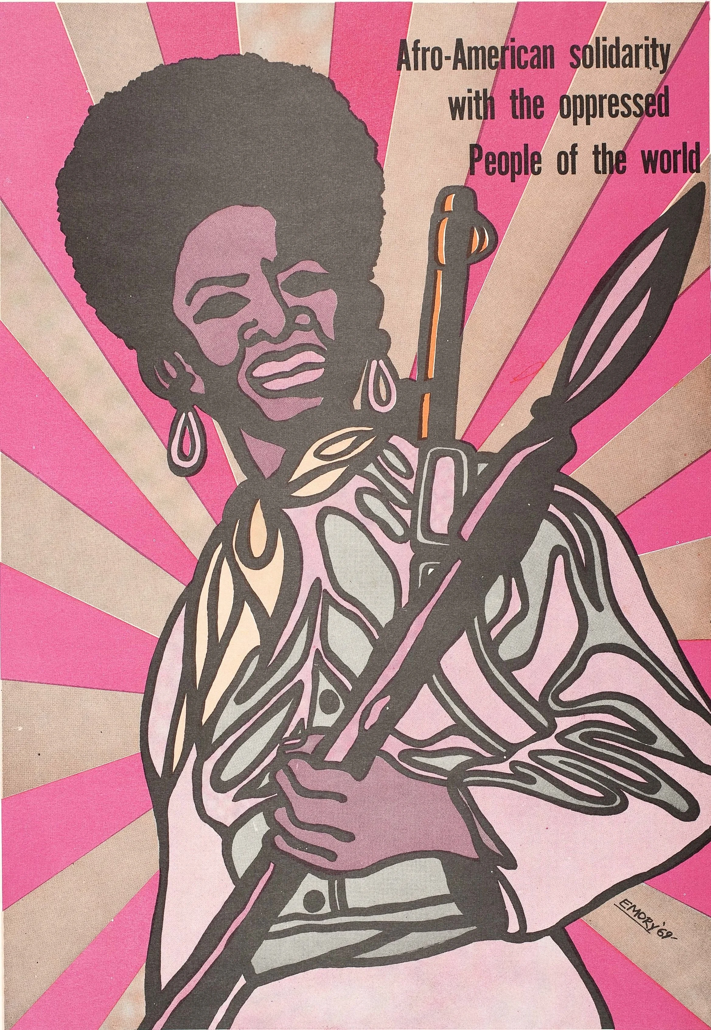
Black Panther Party poster. 1969. Emory Douglas, artist. Poster. Collection of Oakland Museum of California. “The people saw themselves in the artwork. They became the heroes. They could see their uncles in it. They could see their fathers or their brothers and sisters in the art.”
Color, type, and the language of the visual
Color is the fastest channel of emotional communication we have. Before anyone reads your headline, they've already felt your palette. For example, the suffragette colours – purple, white, and green – were chosen with precision by the WSPU in 1908, with purple for loyalty and dignity, white for purity, and green for hope. Women were encouraged to dress in them; shops sold merchandise in the same palette. The colours became the movement before the movement had a name everyone recognized. The practical lesson: choose your palette with the same intention you would a slogan.
Typography works the same way. Every typeface carries a politics – bold or delicate, hand-drawn or precision-set, each choice positions you in the landscape of power and resistance before a single word is read. While many people who make signs for demonstrations might not call themselves graphic designers, that's exactly what they become when putting letters on placards. The 1968 Memphis Sanitation Strike signs – "I AM a Man," with AM bolded and underlined – show how precisely type can carry meaning. Typographer Tré Seals was struck by those signs as a child, and decades later founded Vocal Type to turn protest letterforms from civil rights, suffrage, and labour movements into usable typefaces – embedding those histories into design tools available to anyone.
Both colour and type also carry a responsibility: materials that aren't legible or accessible may quietly exclude the people they were made for. Accessibility isn't a technical afterthought. It's a design decision – and a political one.
“Graphic design plays a big role in protest and spreading the message of a movement, especially when using typography. Activism is all about dialogue – and words can be bold, impactful and thought-provoking.”
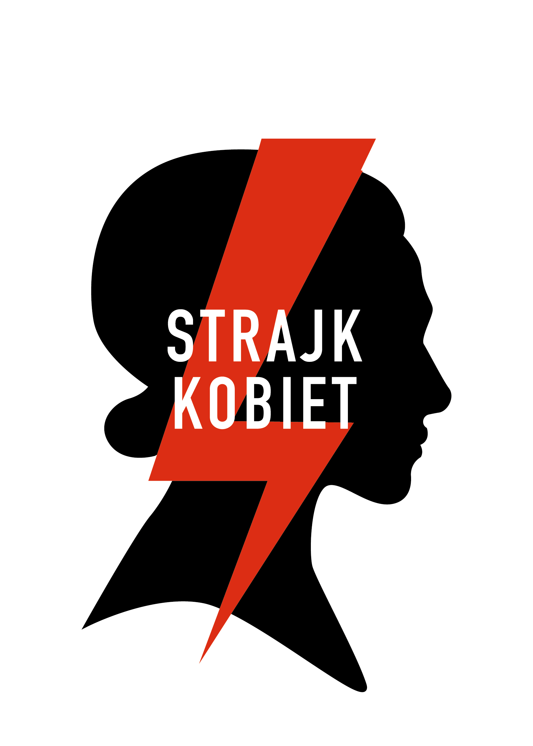
Strajk Kobiet (Polish Women on Strike), 2016. Courtesy of Ola Jasionowska.Design as an organizing skill
Every visual choice a movement makes is an argument – from colors and typeface to a visual's accessibility. What design literacy gives activists and organizers is the ability to make those choices consciously – to understand that the aesthetics of a movement shape who joins it, who trusts it, and who it can reach.
In the digital age, that literacy has a new set of demands. A graphic designed for a march doesn't work as an Instagram Story. A PDF optimized for print is unreadable on a phone. Algorithms reward images that stop a scroll – high contrast, bold type, a single legible idea – and punish complexity. This shapes which movements get seen and which disappear into the feed. Understanding the visual grammar of the platforms your movement is part of the organizing work.
At the same time, digital tools have lowered the barrier to entry. Platforms like TheGreats.co – a free platform for awesome socially engaged visual content powered by Fine Acts and built specifically for activists, nonprofits and educators – alongside open-source design toolkits and downloadable assets, the gap between a grassroots group and a professional-looking campaign has never been smaller.
Designing for impact starts with the right questions. Who are you trying to reach – and does your design actually speak to them, or past them? Does it work at thumbnail size, on a phone screen, chalked on a pavement? Can someone reproduce it without a budget or a printer? Does it include the people it claims to represent? And beyond all of that – does it make someone feel part of something larger than themselves? That feeling of recognition, of solidarity, of we are not alone in this – that's what the best protest design does that words alone cannot.
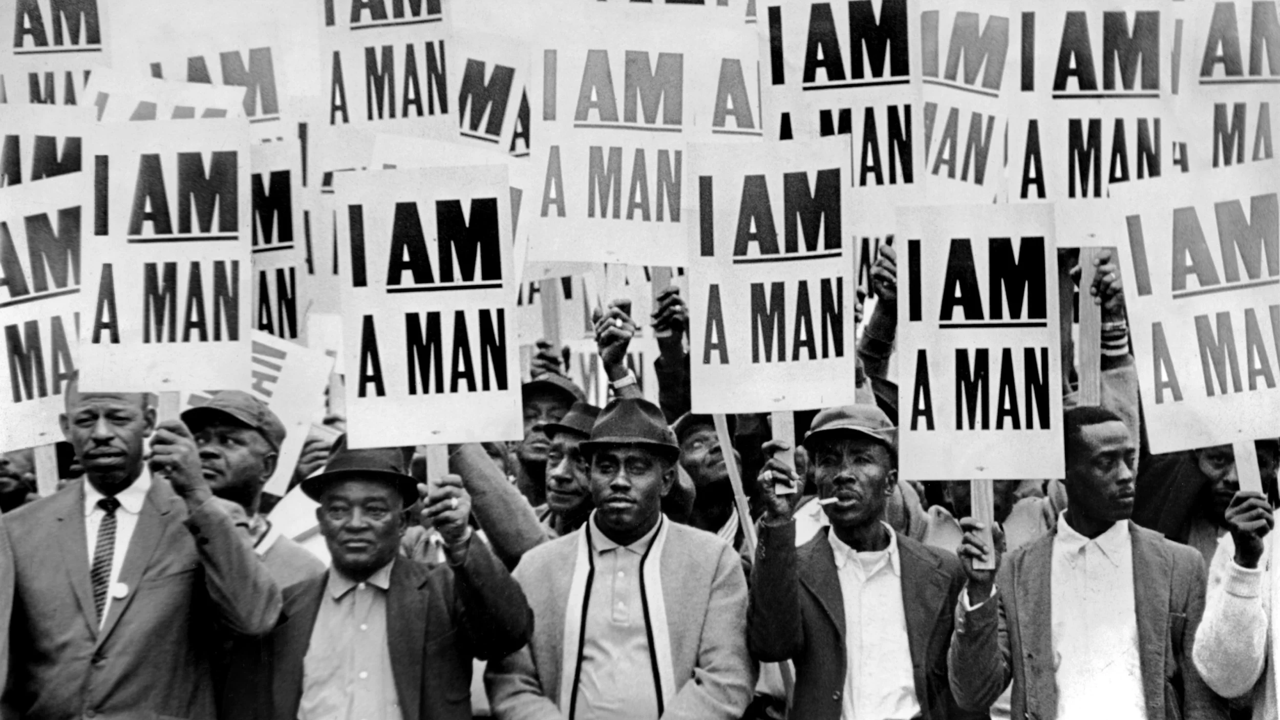
The 1968 Memphis sanitation strike.
Photo (c)  Richard L. Copley
Source: Rutgers.edu
Every visual choice a movement makes is an argument – from colors and typeface to a visual's accessibility.
〰️
〰️
Explore TheGreats.co – a free platform for awesome socially engaged visual content powered by Fine Acts and built specifically for activists, nonprofits and educators